Case Study
Alliance Fitness Platform
After completing my Experience Haus Product Design course, I wanted to work through the process independently for my next project to reinforce my learnings. I also wanted to build more skills in Figma and utilize the Prototype features.
I asked my partner to give me a brief for a product that would fit into her life, and that brief was to create a Fitness Platform for Independent Coaches.
I wanted to undertake an expedited process due to practical limitations - being a solo designer working on a theoretical brief, so this project was also an experience of priority setting and resource scarcity.
Prototype with Design Notes
This is a long case study, so here’s a TLDR access to the Prototype alongside some notes explaining the functionality.
This may take a few moments to load.
Discover
The Brief
I started by interviewing the client to identify what she wanted from the platform. Her experience with fitness apps as a user, as well as health apps in general, is quite sophisticated for a non-professional. She is also close to a number of personal trainers who run small businesses, so has heard many gripes and frustrations with these platforms.
The app, unnamed at this point, needs to help a coach...
- Connect with clients
- Allow tracking of workouts and progress
- Communication between client and coach
- Allow integration with health and nutrition apps like Garmin, Apple Health, and MyFitnessPal
- Comprehensive exercise library
The core philosophy of the app is to give people control and support in achieving their fitness goals without using other apps.
The deliverable is a working prototype in Figma to demonstrate the feature set.
Discover
Competitor & Desk Research
The Fitness App market is highly competitive and covers two areas; Coaching Apps and Workout Apps.
A Coaching App will cover much of what a Workout App will, but needs ways for the Coach to manage the content delivered to their clients and managing multiple clients as well as groups. Examples of these include Trainerize, True Coach, Everfit, Coach Catalyst, and Hevy Coach. These are also professional commercial platforms and need features to help the business owner monetize their work.
Workout Apps have become powered by AI recently, with some completely replacing the human coach. Whether AI supported or not, the user engages in a self-guided manner and these apps aim to appeal to a large range of individual users. Examples of these include Fitbod, Arvo, and Hevy.
I also did some Academic Research, looking through...
- Effects of a digital intervention on physical activity in adults: A randomized controlled trial in a large-scale sample (2024) by Ficthner, Tinsel et al.
- Systematic review exploring human, AI, and hybrid health coaching in digital health interventions: trends, engagement, and lifestyle outcomes (2025) by Loughnane, Laiti et al.
- Do smartphone applications and activity trackers increase physical activity in adults? Systematic review, meta-analysis and metaregression (2020) by Laranjo, Ding, et al.
- Also 9 Ways to Supercharge Your Workouts in 2026, According to Experts (2026) by Olivia Vaile... but that’s just an article in GQ!
Takeaways include;
- Retention and completion are higher for human coaching interventions
- The benefits of even small increases in exercise should be consistently communicated in online fitness programs
- Hybrid and AI models could promote engagement and offer positive participant experiences, they could not replicate the interpersonal elements of human-delivered interventions.
- Consistent human support was important for maintaining improvements in lifestyle and sustaining engagement.
Finally I also researched My Fitness Pal; the leading nutrition tracking app, and determined that there is too much to build to have a One App To Rule Them All deliverable. Integration with My Fitness Pal is possible, and it has a very invested audience.
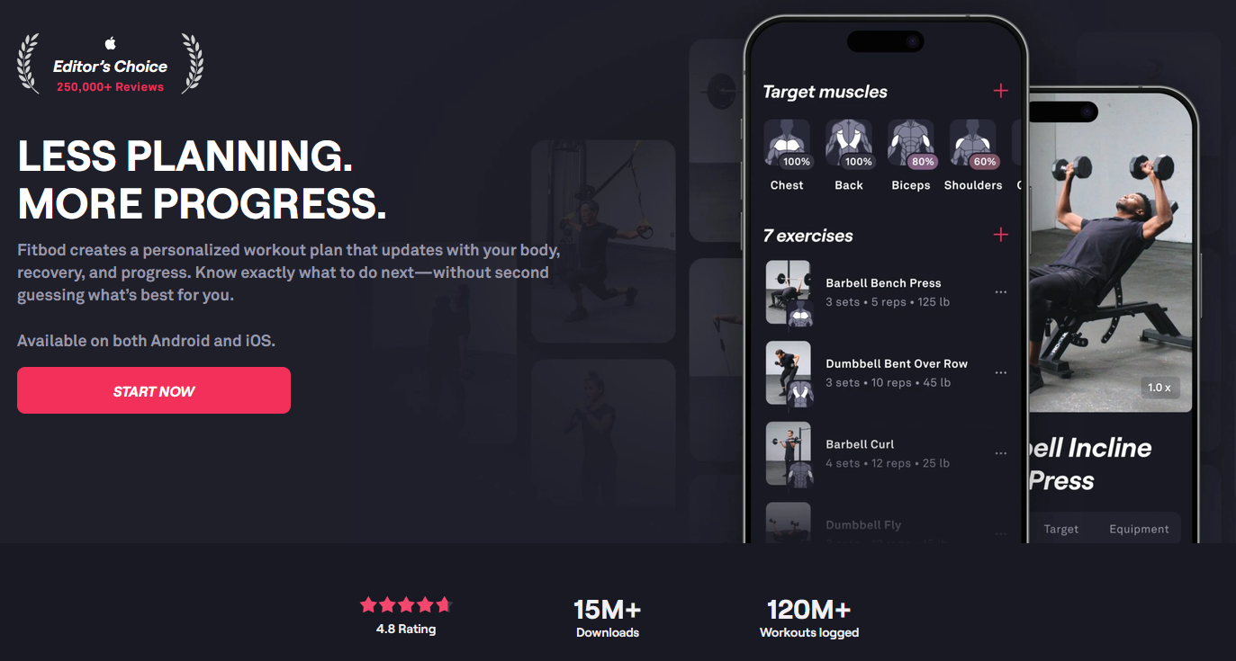
Landing page for Fitbod, the app that most impressed me in its User Experience
Coaching Apps
There is a lot of analysis of Coaching Apps on YouTube. Personal Training has become a big growth industry due to the ease of remote coaching, so that means there is a large industry of influencers attempting to cash in on budding young trainers and the companies fighting to secure their business. It’s also a legacy industry, with some big players in the scene who have extremely comprehensive but bloated and outdated user experiences and business models.
Key takeaways from the research are...
- Exercise Libraries are very important, with a large and diverse set of exercises providing a lot of value to coaches and clients.
- Integration with platforms such as MyFitnessPal, Apple Health, and Garmin is patchy... it may not be simple to integrate everything into one experience.
- The UX of building workouts for clients is convoluted and clunky, particularly at scale.
- Coaches often sell extras and therefore need a form of marketplace.
- Big Coaching Platforms are very expensive for Coaches - they include so many features that the cost to provide the service is very high
- If you’re a small trainer you’re paying a fortune per “seat” and may not make sense (less of a UX challenge but a business opportunity!)
- Platforms like Trainerize cover almost everything and have big brand recognition, but that comes at a cost.
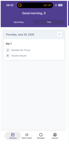
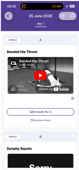
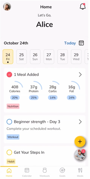
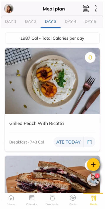
(Left) TrueCoach’s extremely simple interface vs (Right) Trainerize’s home screen and meal plan calendar.
Workout Apps
While not the main focus of the brief, I did want to explore the UX of client-facing apps because much of the research into Coaching Apps raised issues about the client experience. I also really appreciate adjacent experience references for getting inspiration.
As a portfolio piece, I also wanted to work on something more generically tried-and-true. Ultimately the most important people to the Coach are the Clients, so I wanted to explore how other solutions make client’s lives easier.
Key takeaways from the research are...
- The Build-your-workout UX is not needed for our app, as ours is coach-led. This saves a lot of time and effort.
- Fitbod is particularly slick, and there is a noticeable positive difference using an aesthetically pleasing app as opposed to something that’s purely functional.
- There is rarely nutrition integration here, these apps are for just working out rather than overall health goals.
- Social features are integrated, but I’m skeptical as to their usefulness.
- Integration into Live Activities (for iOS, Live Updates on Android) is a really useful feature that means a user doesn’t have to keep the app open all the time.
- Mild gamification is featured, how effective is it?
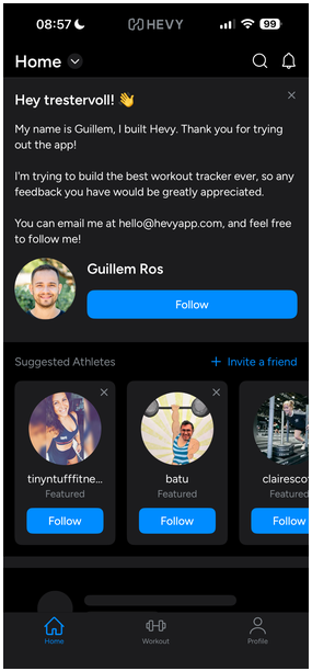
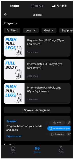
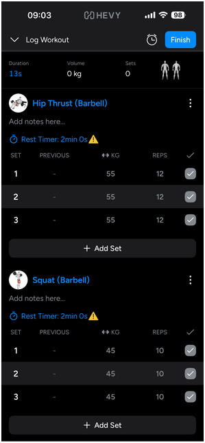
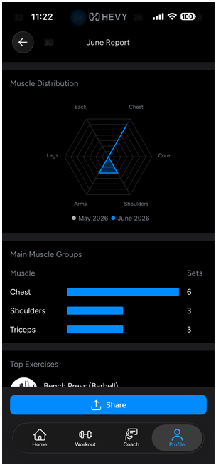
Selection of Hevy’s screens; Home, Workout Home, Workout Logger, Progress Report
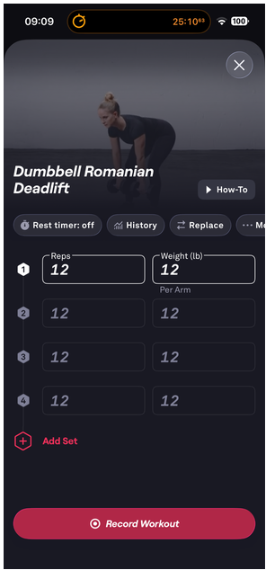
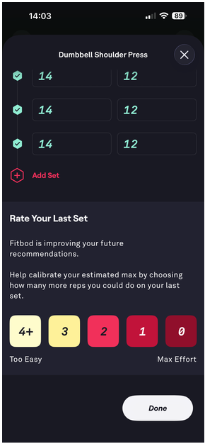
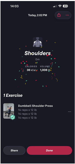
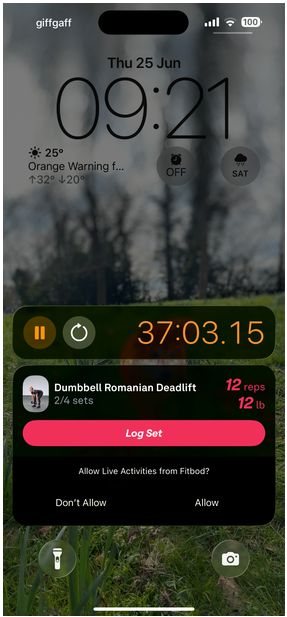
Selection of Fitbod screens; Log Workout, Complete Workout, Workout Summary, iOS Live Activity integration
Discover
User Interviews
Due to the goal of getting this project delivered in a short time frame, I kept the interview side of discovery short. I reached out to the owner of The Empowerment Club, a women’s health community run by a Personal Trainer and Entrepreneur; Ria.
It was tremendously valuable to get her business insights in particular. The main value proposition of her business is actually community. Anyone can do remote coaching on a big platform like Trainerize (at high cost) but to get the results she wants to deliver for her clients and business goals, in-person events and peer support are crucial. It’s a wellness platform rather than just a workout app.
There were many takeaways for exploration...
- More affordable White Label customization > existing platforms are very expensive to put your brand on
- Adaptable programs that let clients pick what works for them (e.g. add-ons, exercise swaps)
- Coach Program building tools are woefully inadequate and frustrating to use
- Boundaries are hard to establish with tools like WhatsApp
- Different people have different check-in behaviours
- Progress is more psychological than technical. People typically don’t trust the process, they want instant gratification.
- For nutrition, a meal library is preferred to meal plans with strict numbers.
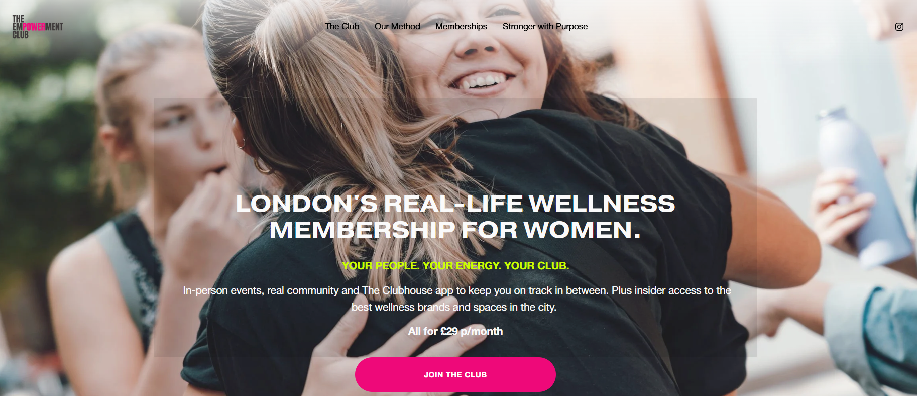
The Empowerment Club is a women-focused whole health community run by a Ria
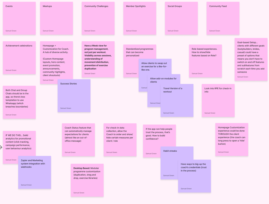
The interview uncovered a tremendous amount of potential feature areas.
Define
Task Analysis, User Stories, and Problem Statement
While preparing and analyzing the interview with Ria, I also did a Task Analysis for client users of the platform.
- Client wants to do their workout
- Client wants to log their food
- Client wants to check their progress
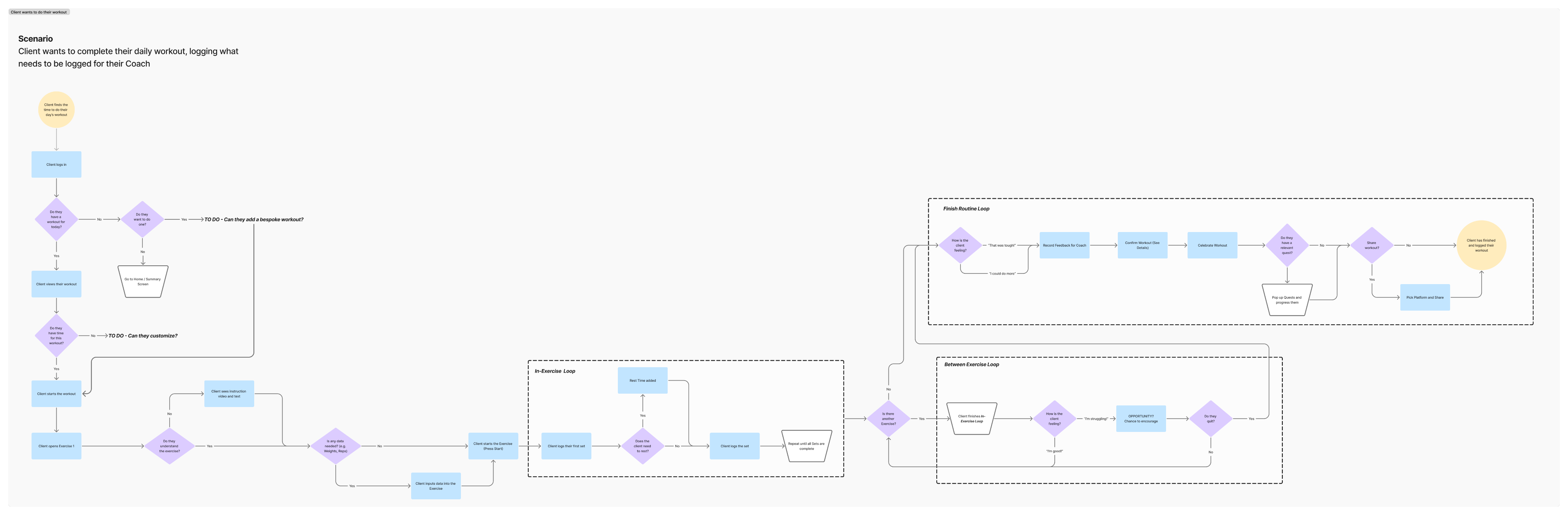
Task analysis of the core client activity for Alliance; logging in and doing a workout. Link to a PDF here.
I also assembled user stories on both the coach and client side based on the interview with Ria.
As a Coach...
- When I’m creating programmes, I want to see an entire training week so that I can balance exercises efficiently
- When I’m managing clients, I want different coaching tiers so I can scale my business
- When I’m communicating with clients, I want structured communication channels so I’m not overwhelmed
- When I’m marketing my business, I want analytics and integrations so that I can improve marketing performance
- When I’m monetizing my business, I want paid-for features to tempt people in the ecosystem to increase revenue.
As a Client with health goals...
- When I’m following a programme, I want exercises adapted to my circumstances so I can stay consistent
- When I’m joining a coaching platform, I want community and connection so that I don’t feel alone
- When I’m checking progress, I want analysis that supports my goals so that I don’t become obsessed with data.
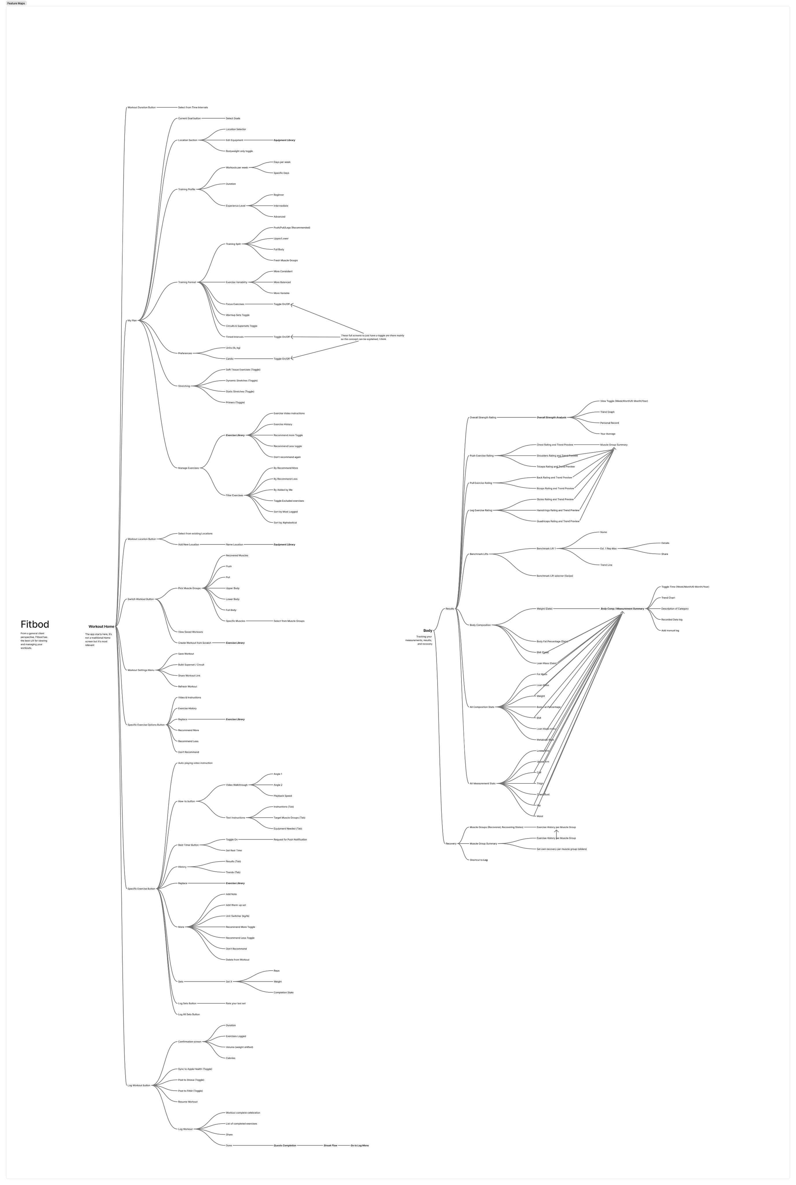
The Site/Feature Map for 2 areas of Fitbod, the main influence for my UX.
It is here that I needed to check the project against reality. To create a fully comprehensive UX for all users in this system would be the work of an entire business.
Holy scope creep, Batman!
At this point I was pretty overwhelmed and decided that a scoped down problem statement would get me back on track and make a realistic deliverable possible.
High Level Problem Statement
Fitness Clients need a tool that strengthens their coach relationship and adapts to their circumstances to support them achieving their wellness goals
Focusing on the clients, and how they interface with the coach, felt like an effective way to keep the coaching relationship central to the User Experience without needing to build two products that work in tandem. It is borne out from the academic research, and in the user interview, that the value proposition of a personal trainer/coach is the relationship not just access to a tool for which weights to lift and how to track your BMI.
Develop
Ideation: Fitbod-inspired Workout UX
From looking at a number of Workout and Coaching Apps, I felt that Fitbod was clearly the most engaging workout UX. It covers all important features, keeps advanced tools hidden unless needed, and it looks professional and modern.
Due to the fact it’s an AI-based app that relies on the user’s feedback to calibrate, I thought it was quite interesting to take those features and incorporate them into the Client:Coach relationship.
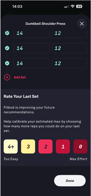
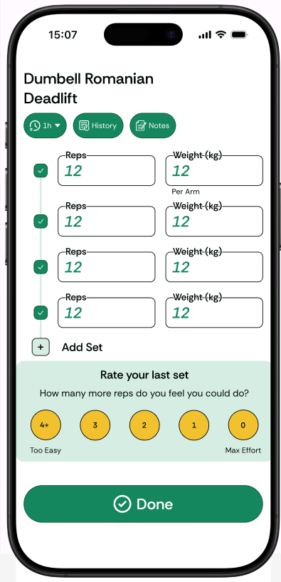
Fitbod’s post-workout evaluation for AI can be repurposed as feedback for the Coach.
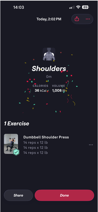
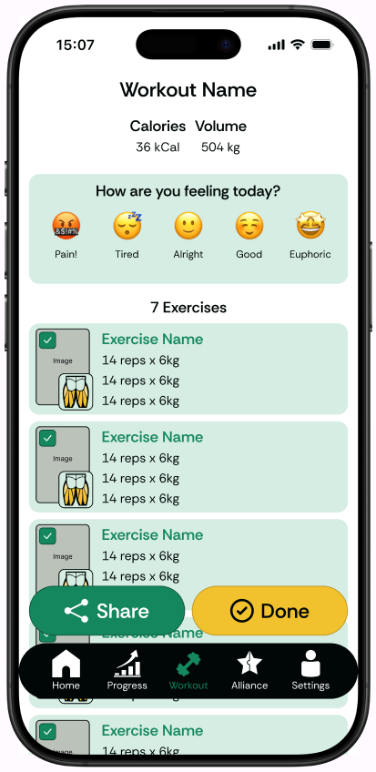
The workout summary celebration with a share option is practical and a positive moment for the user... in the Alliance version, we take this opportunity to deliver wellbeing feedback to the coach while sharing will automatically post to the Activity Feed.
Develop
Ideation: The Alliance area
Alliance is the core area of the app that highlights the value that coaches want to showcase.
Both Coaching and Workout Apps have a lot of features. Typically the navigation bar is misleading, with many submenus and functions hidden a layer or two deeper in an area. There are also considerations for alternate revenue streams so I thought that the Alliance menu would be a great umbrella linking a lot of ancillary features - because they’re all related to your relationship with your coach.
Progress Pics, Medals (Gamification), and Chat are standard modern features but packaging them under Alliance highlights the importance of that relationship, plus we have a natural place for Events and the Library (where both documents and On-Demand content can be sold and accessed)
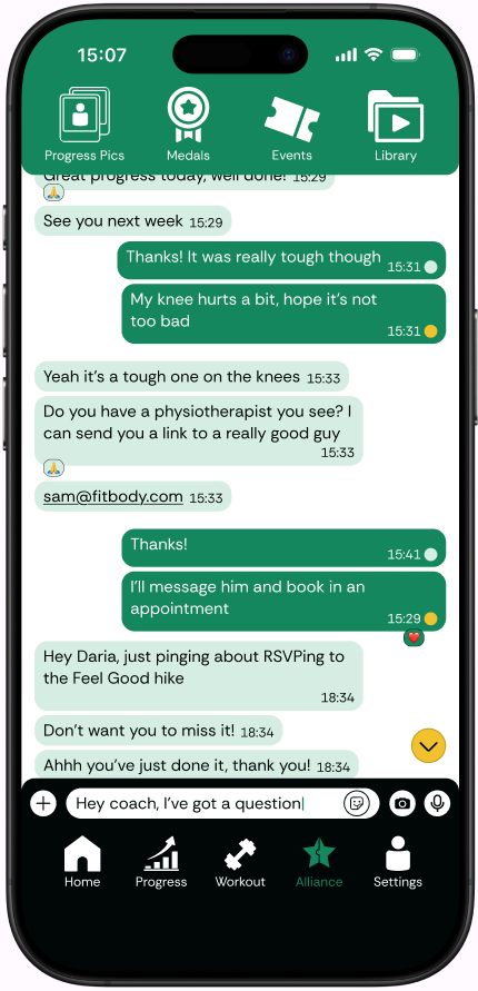
Wireframe of Alliance Area: Alliance opens as a Chat but has a top-bar with 4 main areas that represent your partnership
Develop
Ideation: The Home Screen
The Home Screen is the first place we engage with users therefore it’s a perfect place to highlight their thriving healthy lifestyle. There’s a big call to action for the user’s workout but also an activity feed that brings in community updates and the calendar to help users plan their week.
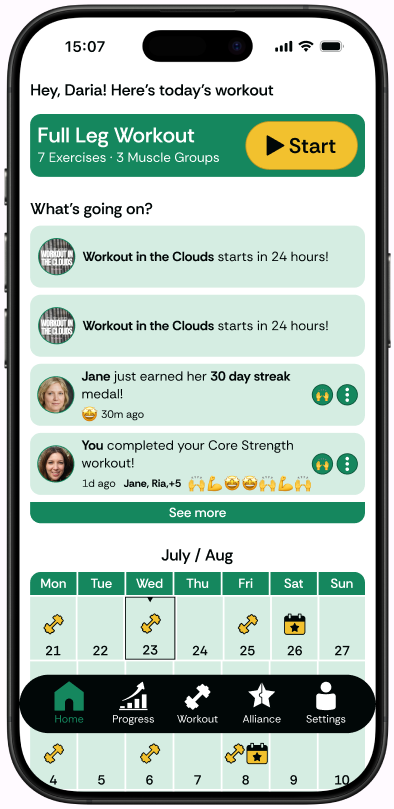
Wireframe of Home Screen: Workout call-to-action, activity feed, and calendar summarize everything a healthy fitness user needs
Develop
Typography & Colour
Alliance is a modern, friendly, white-label platform that wants to build trust in the coach while being warm enough to foster a community. As a white-label concept, ultimately I would like to provide coaches the ability to customize the whole experience to their brand colours. With that in mind, the default shouldn’t be too bold but work generically.
For Colour Palette I wanted to evoke health, growth, and success while not being too masculine.
- Green is typically a positive colour associated with nature and health, so I moved it towards a cooler end of the spectrum to pull away from pure nature and modernize it for this digital experience.
- A strong contrast for the accent, while staying in colours seen in nature and encouraging happiness and positivity meant Golden Yellow was a natural fit.
- Staying in the same hue for the secondary, allowing background cards to stand out from a white background, led me to a Mint Green as an unintrusive canvas
- On the dark and light neutrals, a Pure White vs the Green was necessary for WCAG AA Accessibility rating with a Green Off-Black providing a dark colour for comfortable text while staying cohesive with the green theme and just reaching the 4.5 contrast requirement
I do still feel the colour palette is a little on the softer side, but with a slight skew towards a feminine audience I don’t think that’s necessarily a problem.
I tested a number of San-Serif typefaces for readability and personality at different weights and sizes while following Apple’s iOS Human Interface Guidelines. I also checked in with LLMs for general public opinion on practical use - is it overused? what are some common issues? any edge cases to look out for?
I landed on Rethink Sans as the font of choice, it fit the bill and there is a personality to it that feels refreshing to me.
Primary
Forest Green
#15875E
Secondary
Light Mint
#D5EDE2
Accent
Golden Yellow
#F2C12E
Light Neutral
Pure White
#FFFFFF
Dark Neutral
Green Off-Black
#010707
Heading - SemiBold 24px
Subheading - SemiBold 18px
Body - Regular 15px
Body Bold - SemiBold 15px
Body Small - Regular 12px
123 - SemiBold 48
Heading - SemiBold 24px
Subheading - SemiBold 18px
Body - Regular 15px
Body Bold - SemiBold 15px
Body Small - Regular 12px
123 - SemiBold 48
Heading - SemiBold 24px
Subheading - SemiBold 18px
Body - Regular 15px
Body Bold - SemiBold 15px
Body Small - Regular 12px
123 - SemiBold 48
Deliver
Wireframes & Prototype
As mentioned above, Fitbod really worked well enough as an inspiration for most of the Workout and Progress related screens so I did an adaptation of their design. For everything else, I started in paper with some rough layouts.
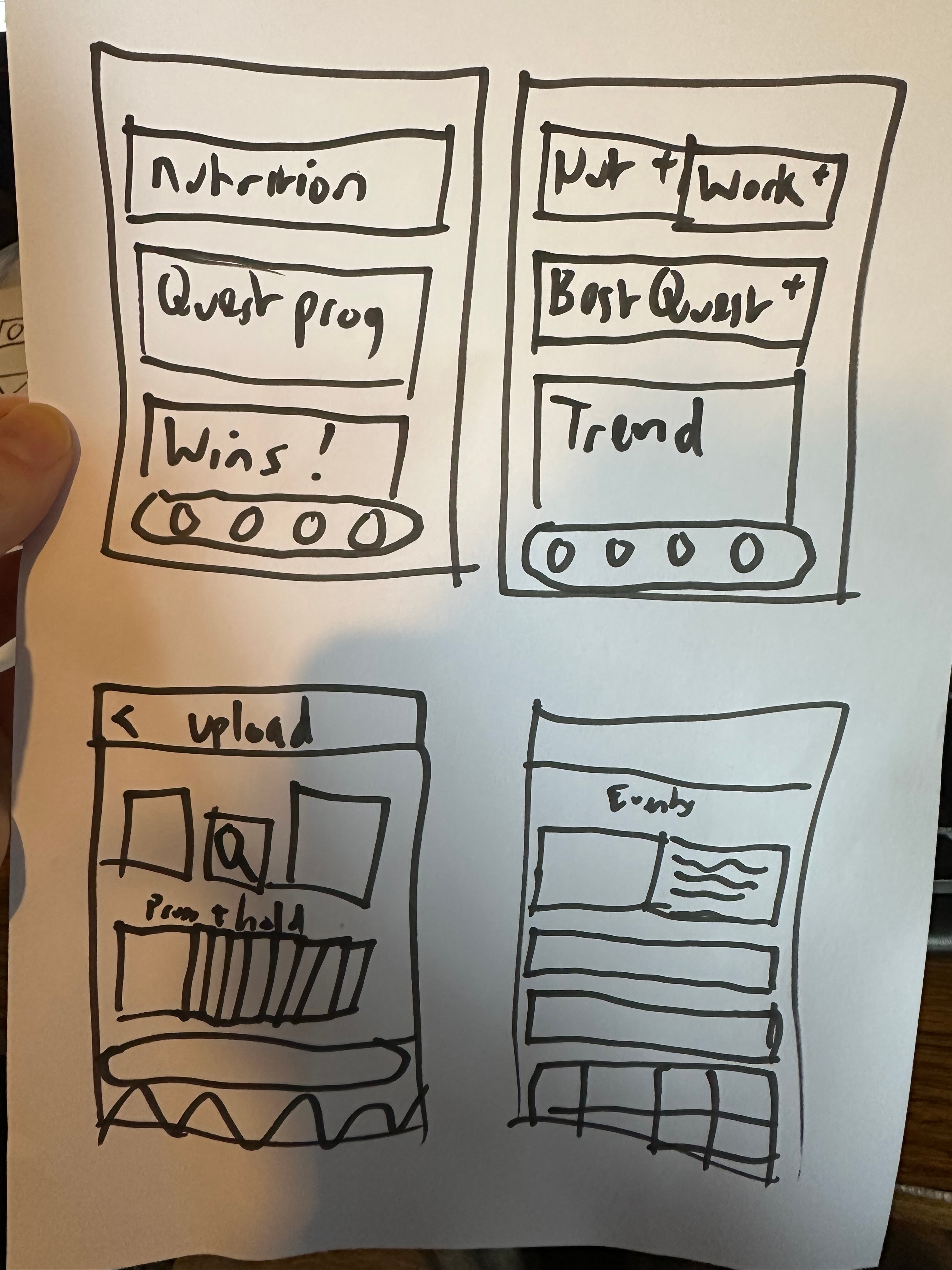
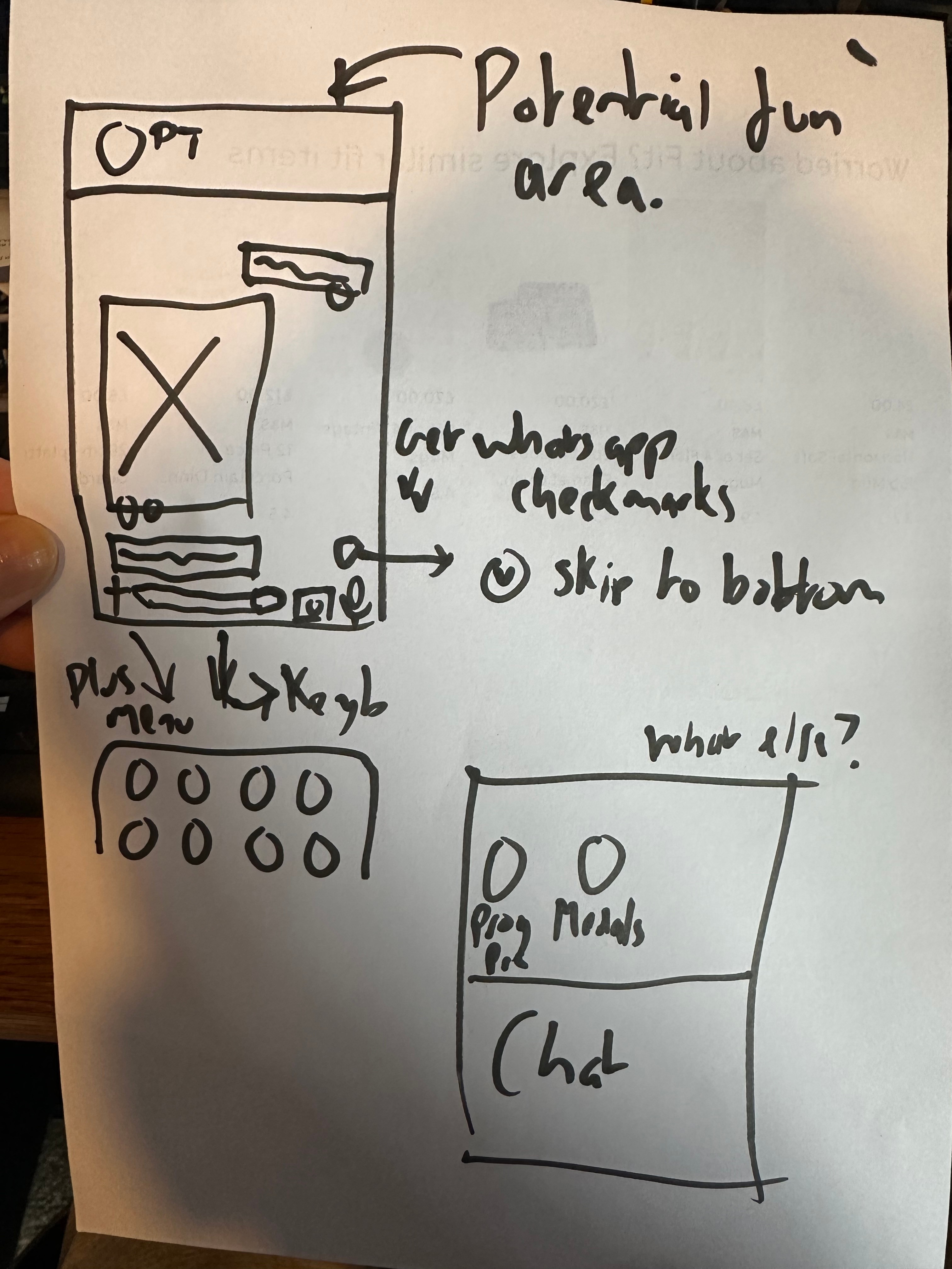
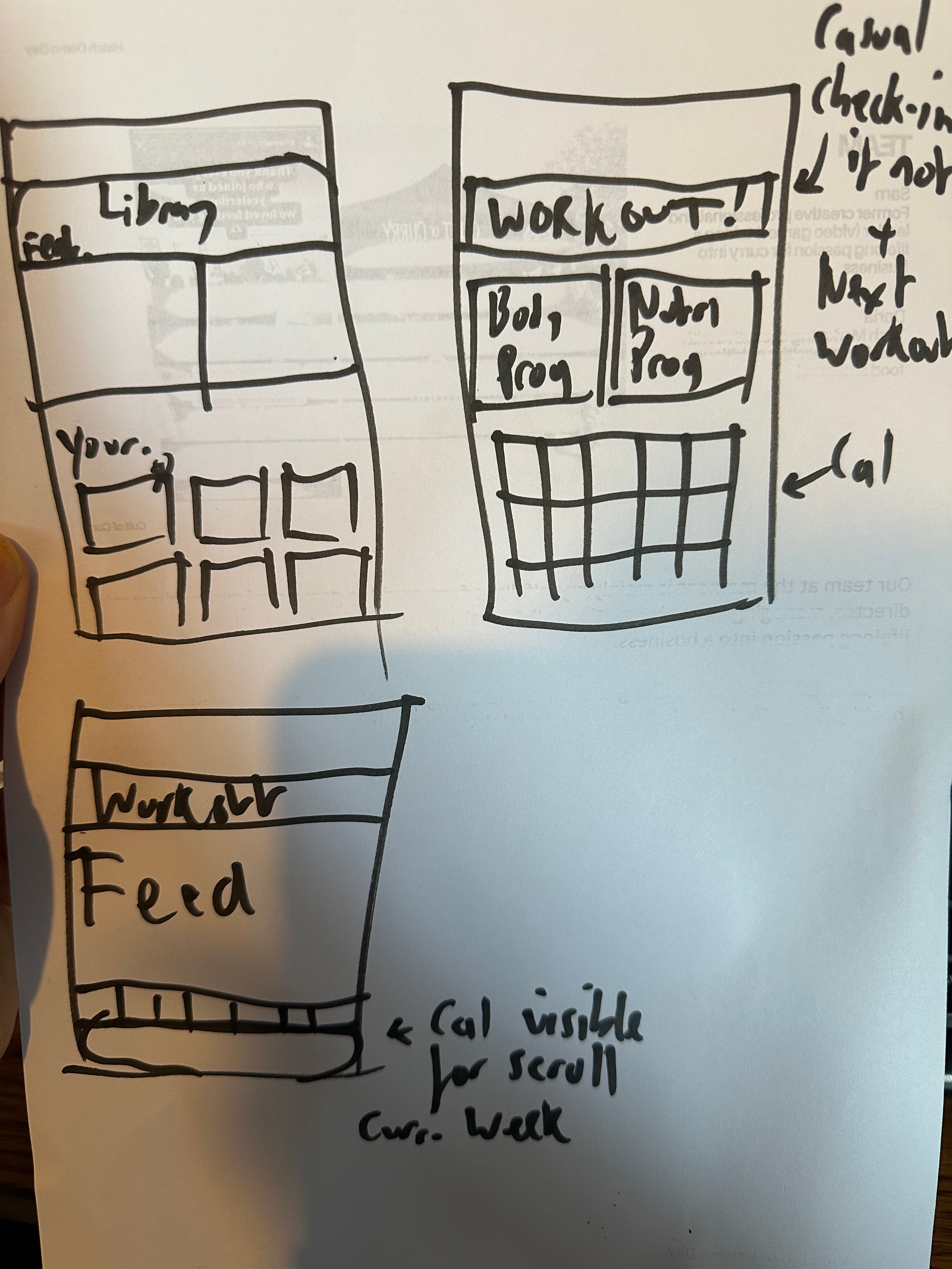
Paper wireframes
Other influences I explored were...
- WhatsApp for the chat interface - it’s the chat system most people are used to so it felt wise to keep things familiar.
- Apple’s Cover Flow for progress pics - I wanted to add a little personality to the Progress Pics feature and thought that the old Cover Flow UX might be quite cool to compare between two pictures. It did feel rather inconsistent and over-engineered in the end, so I eventually swapped for a classic OS photo gallery grid.
- Instagram for notification UX for social feed updates - Another popular app that covers a wide range of functions in a single template.
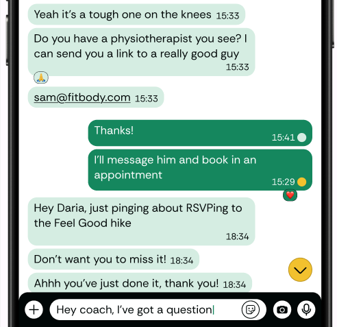
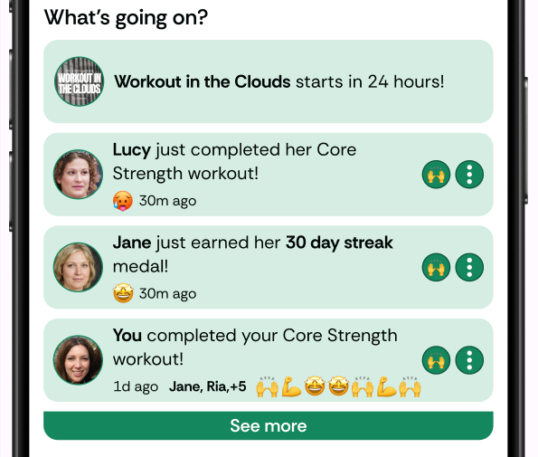
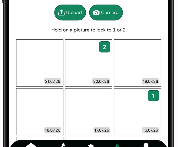
Wireframe elements inspired by Whatsapp and Instagram, with a standard photo gallery after exploring (and rejecting) an Apple Cover Flow design
Prototype with Design Notes
Deliver
Future Roadmap (Coming Soon)
If I were to expand on this concept, I would work on the following priorities
Coming Soon