Case Study
Saphe’s Home & Beauty UX
Saphe Tech is a startup that aims to make life easier for individuals with allergies & intolerances and the companies providing products and services. People with hypersensitivity can experience a real struggle to navigate their daily lives, and companies are expected to communicate and understand the effects their products/services may have on customers.
This case study covers the work I did as part of the Experience Haus Product Design course I undertook in March 2026.

x

Discover
The Brief
Saphe started as an ingredient list scanner app for food products but wanted to expand into home & beauty while also exploring the ways that their platform could be integrated into companies’ workflows - an opportunity for commercialization as well as an important part of the company mission.
Our goal was to create innovative and intuitive design concepts that help users feel safe, informed, and empowered when choosing health, beauty or household products.
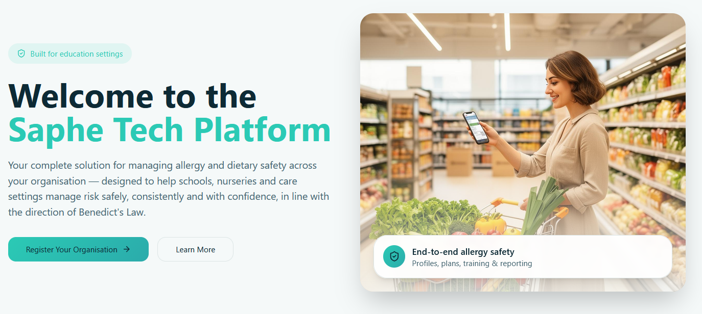
Saphe Tech initially aimed for an audience of schools, nurseries, and care settings to take advantage of upcoming UK legal changes (Benedict’s Law)
Discover
Stakeholder & User Interviews
Our first step was to start understanding the users that Saphe was aiming for and the context of the business. We developed a research plan that started with a stakeholder interview. Our goal was to move from a high-level brief to a concrete design roadmap by defining business priorities, technical hard lines and what success looks like.
We also developed a screener survey that was responded to by 33 users with hypersensitivity issues, leading to 10 video interviews.
Key insights were...
- Labels can’t be trusted - Users no long believe claims like “hypoallergenic”, “fragrance-free”, or “natural”. Past misses have eroded trust to the point that certifications are treated as noise.
- Ingredients can’t be decoded - Even motivated label-readers can’t make sense of chemical names, and concentration is never shown.
- Trial-and-error is the default - With no reliable alternative, people test products on their own bodies. It’s slow, expensive, and sometimes dangerous.
- Verification is exhausting - A single new product can take a week of research before purchase. The constant time, cost, and double-checking creates decision fatigue and sometimes leads to errors.
- Trust comes from “people like me” - When labels fail, users turn to reviewers with the same skin type, condition, or diet. Dermatologists on social media carry more weight than brand claims.
- Users want a personal safety signal - Almost everyone described the same fix: an instant way to know if a product is safe for them not safe in general. Many are ready to use a tool like this today.
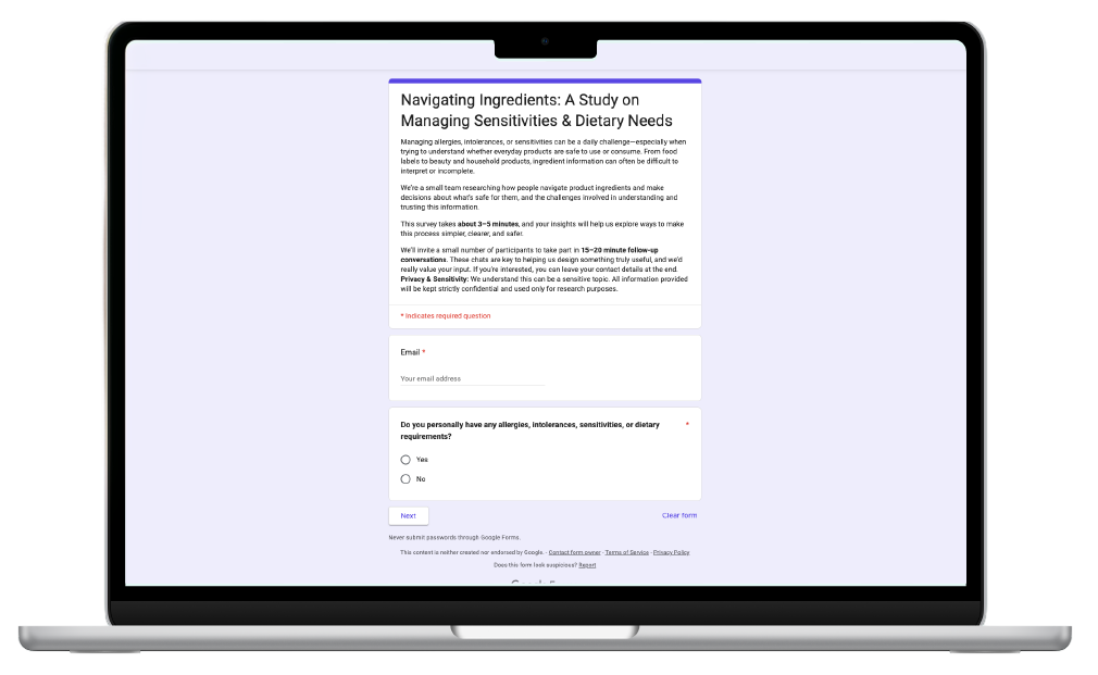
Our screener survey was created in Google Forms and sent to potential interviewees in WhatsApp groups, Facebook groups, and Slack communities. We wanted a diverse group of users to represent the audience Saphe was hoping to support.
Discover
Competitor & Desk Research
Product scanning is well-trodden ground when it comes to user experience, with a range of apps from simple to comprehensive. Our brief to focus on Beauty unlocked a whole range of skincare apps which provided not only UX references but also commercialization ideas.
Barcode Scanning and Product Search is a baseline feature that all apps support; leading to a Product Analysis that rates the product’s suitability.
Yuka, INCI, and SkinSAFE are safety focused. They focus on scientific legitimacy to build trust. Yuka is the closest competitor to Saphe with a simple, clean, focused experience with no bells or whistles.
OnSkin, Skin Bliss, and Think Dirty are dedicated skincare apps that empower users to find products that work for them, these apps have strong value propositions and complex specialist features.
Saphe has an opportunity to enhance the value proposition of the safety apps with user empowering tools that fit into their daily lives. There is a unique niche in multi-profile support and education, in the app ecosystem.
For Desk Research, I referenced the Nationwide Catering Association (NCASS)’s Risk Assessment materials (a serendipitous benefit of having run a hospitality business) as well as guidance from Anaphylaxis UK and the Medicines & Healthcare products Regulatory Authority (MHRA). These opened up fertile ground for opportunities based around compliance and the B2B facets of Saphe’s vision.
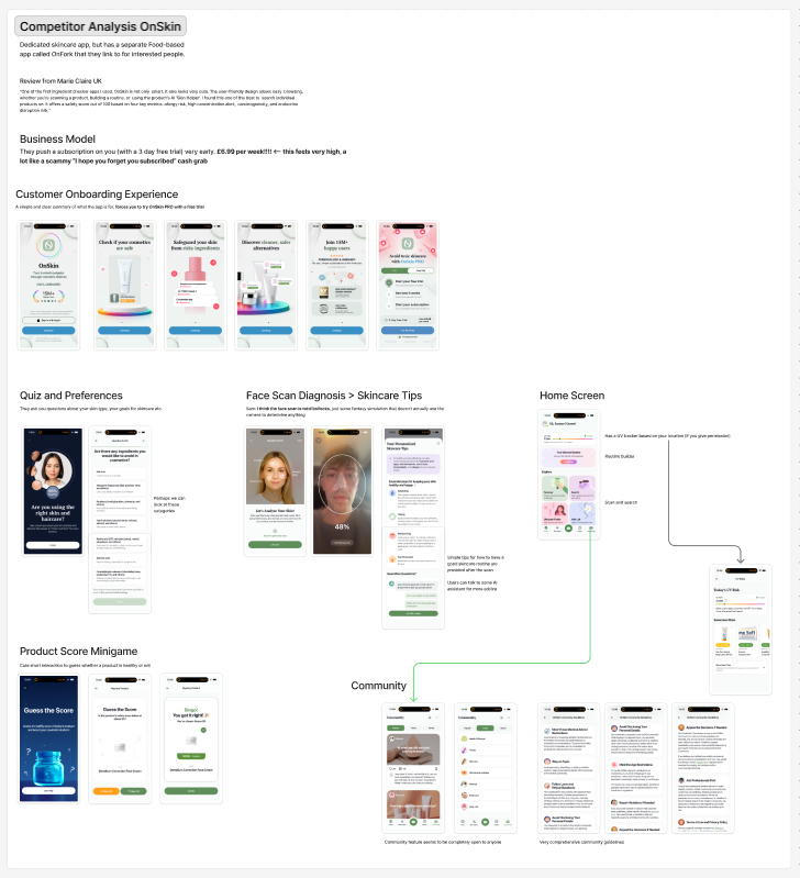
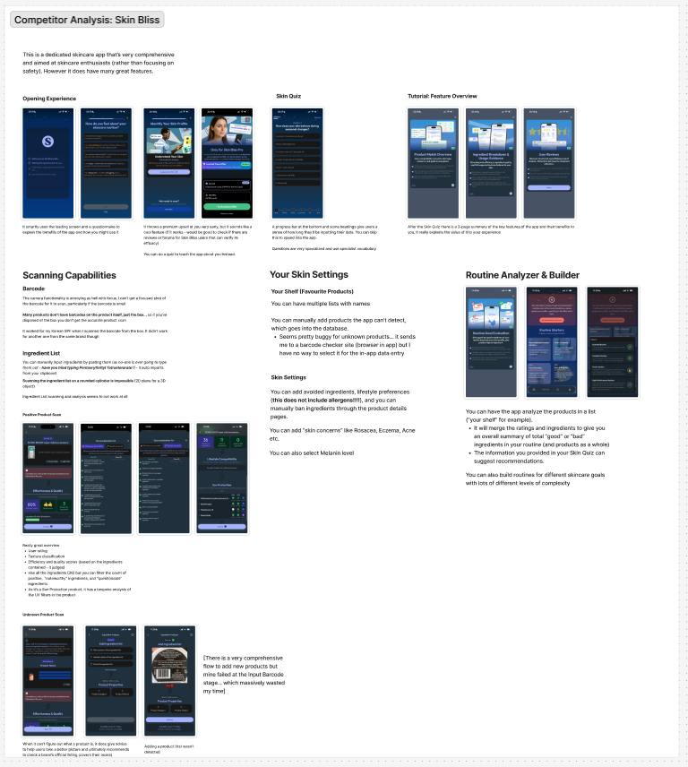
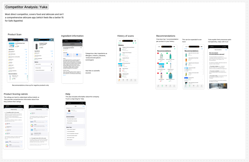
Skincare is highly competitive so there was a lot to learn from testing apps ranging from non-commercialized tools to fully fledged subscriptions
Define
Personas
Based on our interview findings and analysis, and our Proto Persona work (see More Details), we identified 3 main personas for our design strategy.
For each of these we identified Interests, Needs, and Influences along with Motivations and Goals. These help us understand how each persona lives their lives and helps us determine Behaviour, Emotions, Pain Points, and Opportunities.
Our role moving forward is to balance these personas and prioritize the right feature set for Saphe’s business goals.
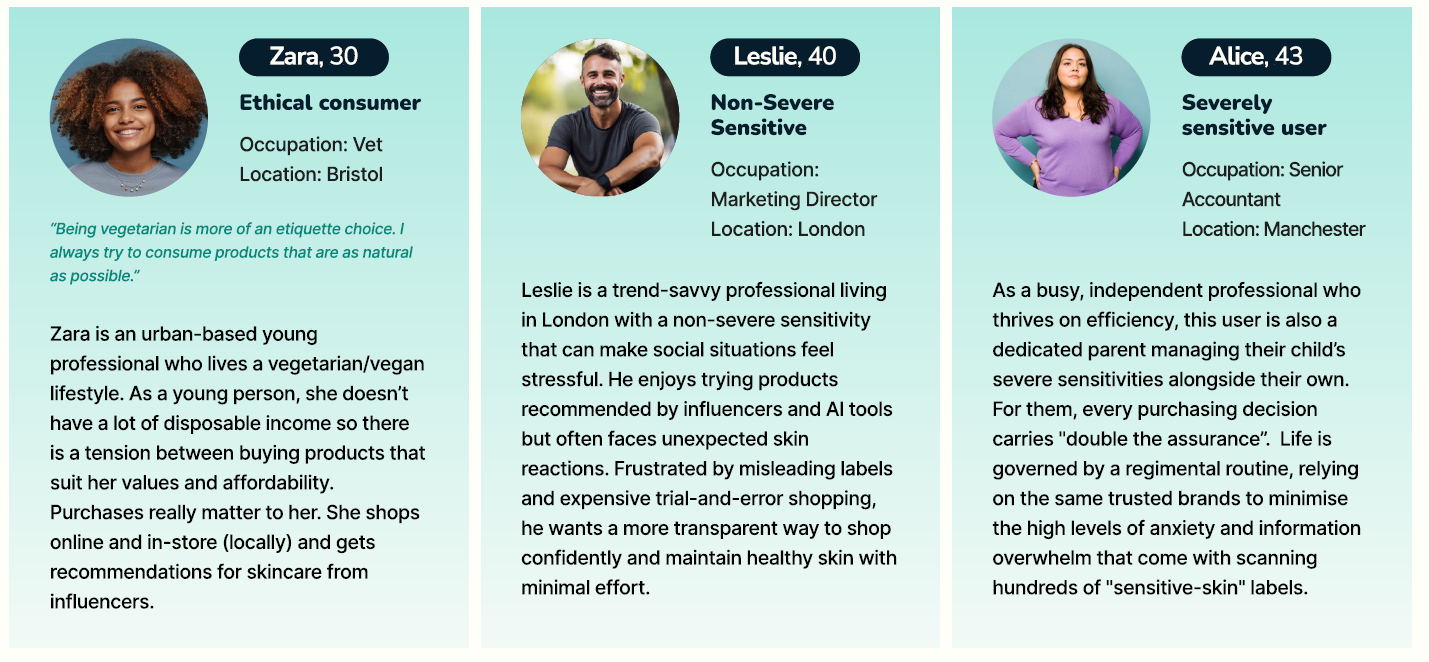
Our three personas cover a wide range of motivations, which can inform the importance of certain features in our ideation phase.
Define
Problem Statements & User Stories
High Level Problem Statement
People with hypersensitivity struggle to shop confidently because existing tools are inconvenient, difficult to trust, and not tailored to modern, empowered consumers.
The pillars of Saphe’s platform direction are Convenience, Empowerment, and Trust.
Our User Stories emerged from the Personas, Jobs to be Done, and Task Analysis. As can be seen, Severely Sensitive Users have more stories overall and lean towards Trust... whereas Non-Severe users care more about Convenience and Empowerment.
At this point in the process, our team was diverging into our own individual concepts so I also developed a few more specific Problem Statements to guide my hunt for solutions (see More Details)
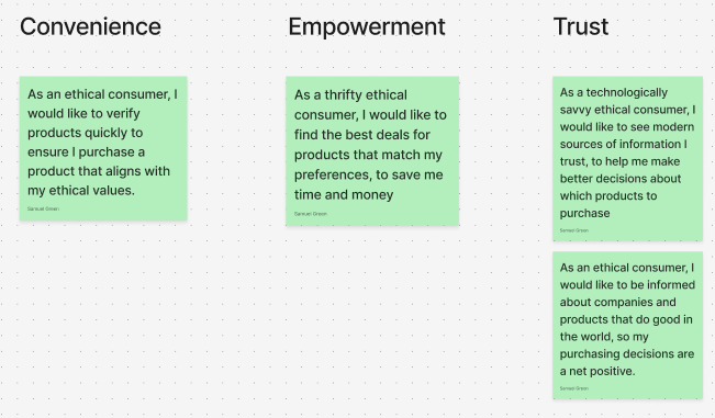
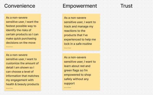
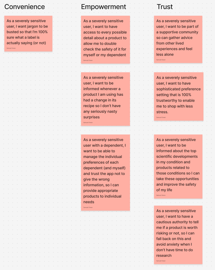
User Stories sorted by Persona (Ethical Consumer, Non-Severe Sensitive User, and Severely Sensitive User).
I developed 8 Problem Statements to further refine the possibility space and ensure we were covering the brief and context of the business. Then I categorized them into themes.
Convenient Analysis
- Saphe needs a way to instantly flag a product’s suitability because many people don’t have time to perform meticulous research.
Modern Shopping Experience
- Saphe needs comprehensive shopping tools with filters like price, brand, and ratings, because users are modern consumers not just people with sensitivities.
- Saphe needs a way for users to manage their historic product engagement to help them narrow down which products work for them, empowering their shopping experience.
Building Trust
- Saphe needs a way to inform users in a format they trust, because misinformation is prevalent and damaging.
- Saphe needs a way for non-severe users to learn how to identify safe products without needing to open the app, so they’re empowered and less stressed in the wild.
- Saphe needs a way to build credibility & trust with users, so they feel safe to use it.
- Saphe needs a way for users to dive deeply into sensitivity information, so they can feel they’ve done appropriate due diligence based on their needs
Managing Multiple Users
- Saphe needs a way to manage multiple user preferences, so people can shop for others (i.e. children)
Develop
Ideation & Product Management
One of the key learnings of engaging with the Saphe project, and working under the Experience Haus’ tutelage, was the understanding that you’re not restricted to the app when ideating around solutions.
Below are some examples of my Ideation for two of the Problem Statement categories, using How Might We questions to expand the realm of possibility.

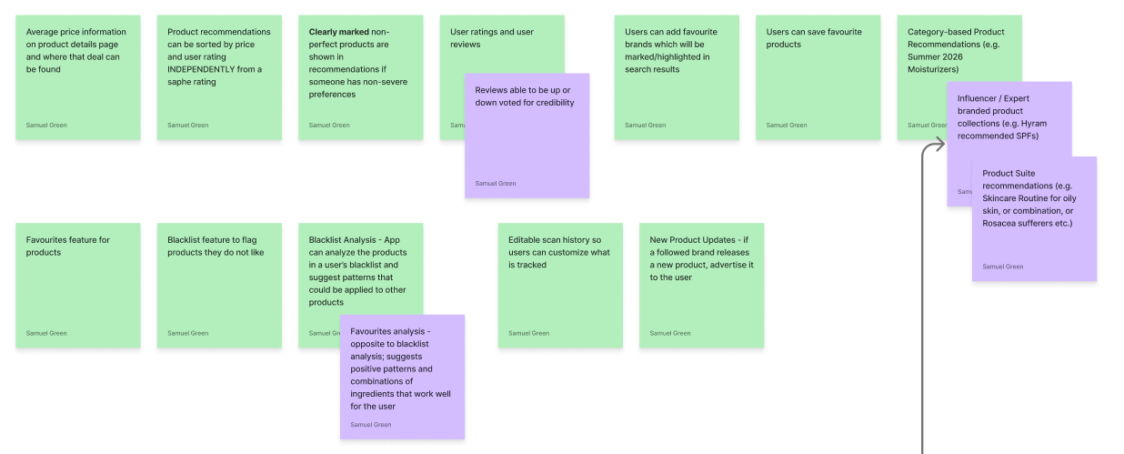
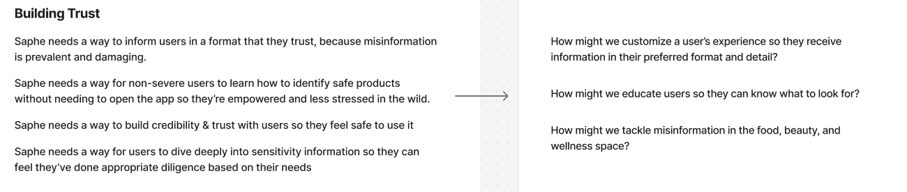
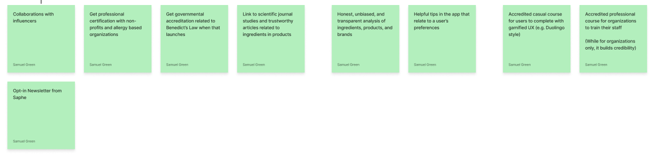
In real life, people use whatever information and tools they have available to them. Part of the Saphe Founder’s mission is to make life easier for people with hypersensitivities, and if users don’t even have to open the app then the mission is still fulfilled. For example, in Building Trust only two of these solutions are 100% app-based, yet they are all activities that Saphe as a business can perform to build trust with users.
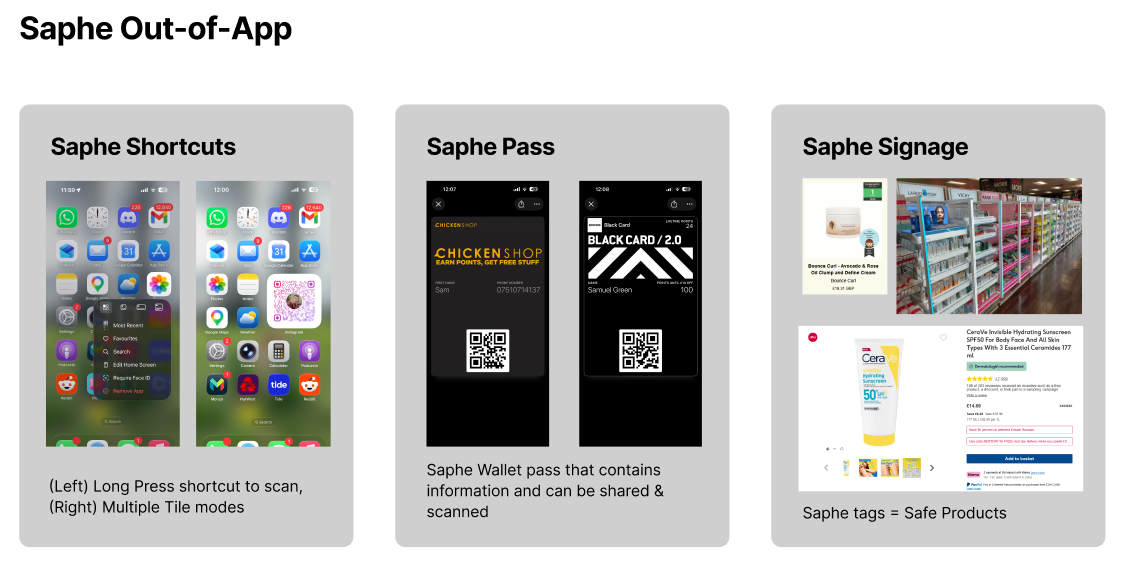
Examples of some out-of-app solutions that align with Saphe’s goals.
As with any project, priorities and resources need to be considered. Saphe & Experience Haus project’s deliverable was individual design concepts and presentations. There were 7 other designers tackling the same brief so I decided to cover the essentials but focus on providing new design concepts that stood out from the competitors in the market. I wanted to provide fertile ground for future exploration while still meeting the founder’s goals.
Develop
Ideation: Saphe Start & Saphe Study
Onboarding is a crucial element of any user experience. It’s all well and good to say you’re empowering users, but if you overwhelm them then they’ll likely quit before they’ve committed. This was a lesson engrained in me from my decade in video game design.
When it comes to our High Level Problem Statement - Convenience is a catalyst for Empowerment. If our design isn’t convenient and digestible, users won’t reach the true value we’re providing. This is particularly the case for our Ethical Consumer and Non-Severe Sensitive User personas, who don’t have baked in motivation to use our tools.
My first feature concept is Saphe Start
- A welcome message from the Founder adds a friendly face and builds trust with users upon opening the app
- Saphe Start track, an onboarding set of activities that both teach and signpost how to get the most out of the Saphe experience.
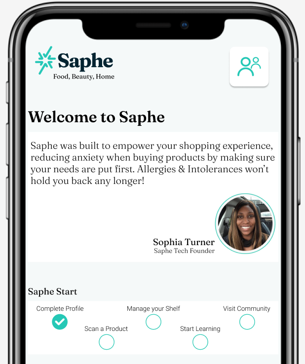
The track starts with progress already, as users complete their hypersensitivity profile as part of the First Time User Experience. Tapping any of the unfinished tasks will highlight the navigation bar to teach users what Saphe can do.
As we see Convenience leads to Empowerment, Empowerment naturally leads into Trust.
A user who understands their reactions to products, is equipped to identify red flags, and comprehends the wild west of labelling will have better discernment and know who to trust alongside trusting themselves. Many of the expanded Problem Statements cover this combination of Empowerment and Trust.
The second feature concept is Saphe Study
- Helpful tips on the home screen (these appear when the Saphe Start has been completed)
- Self-guided Study Courses on topics related to the user’s hypersensitivity profile
- Adjacent to Saphe Study is the Saphe Community, a place for peers to share their knowledge and recommendations as well as providing emotional support.
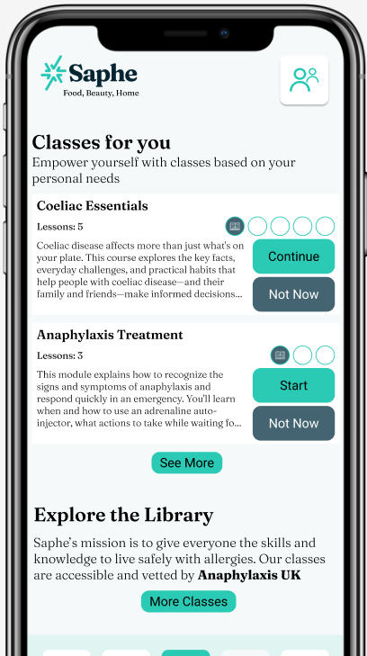
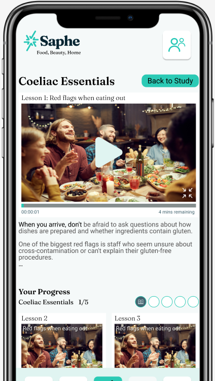
Saphe would have a number of bite-size casual courses to learn about how to manage hypersensitivities. Featuring a collaboration with a charity such as Anaphylaxis UK would build credibility and provide more eyes on an important organization.
Develop
Wireframing
The Saphe design concept isn’t reinventing the wheel so there wasn’t a pressing need for a full process of paper wireframes through to high fidelity, particularly due to the short time frame and lack of resource access. I settled on a mid-fidelity set of Wireframes to be delivered via a short presentation and slide deck (see below).
This was my first project in Figma, so I was learning Auto Layout and applying lessons learnt on Typography and Colour to build a visual design that is friendly, clear, and focused on trust while demonstrating the unique features that I’d proposed.
Home Screen
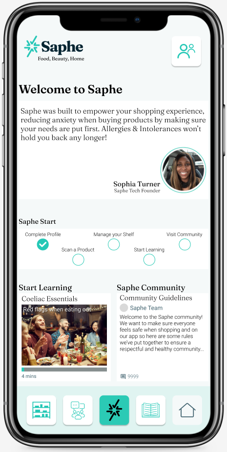
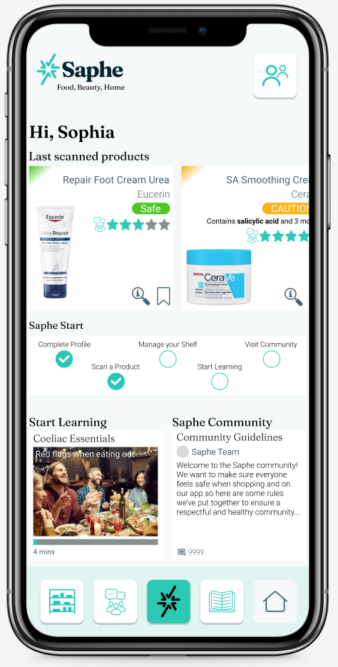
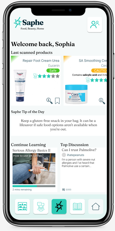
(Left) The introductory home screen with the Welcome Message and Saphe Start track.
(Centre) After the first open, the Welcome Message changes to the core feature; Product Scan History.
(Right) After the Saphe Start track is complete, we replace it with a Tip of the Day further emphasizing education
Product Scan
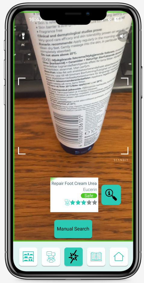
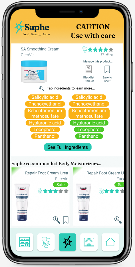
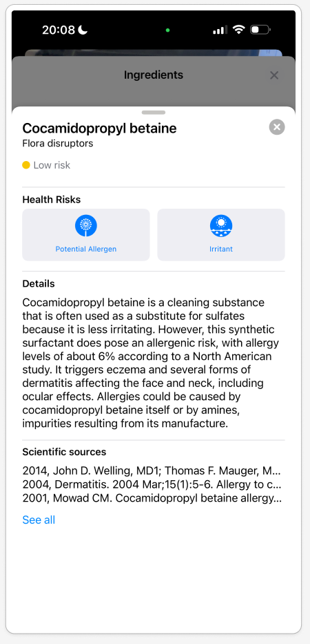
(Left) The Camera is activated for a Product Scan and displays a quick convenient preview, an informative colored screen edge, access to a manual search, and more details.
(Centre) Full product details show the most relevant information, with the choice to see more. Recommendations for safe products are auto-populated and display the community’s rating for a second opinion.
(Right) The competitor app Yuka is a best reference here for Trust Building, it links to specific scientific sources about each ingredient.
Product Search
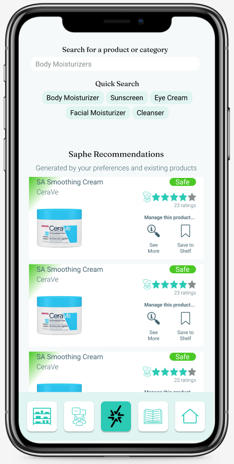
(Left) Upon opening the Product Search there are populated recommendations to accompany the product and category search. Quick Search shortcuts reduce the need for typing a high level search.
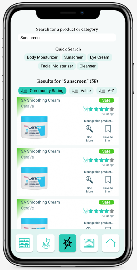
(Right) When a search is entered, they can be sorted by Community Rating, Value, and A-Z. The default is Community Rating which highlights the feature and is the best sorting mode for Trust.
Saphe Study
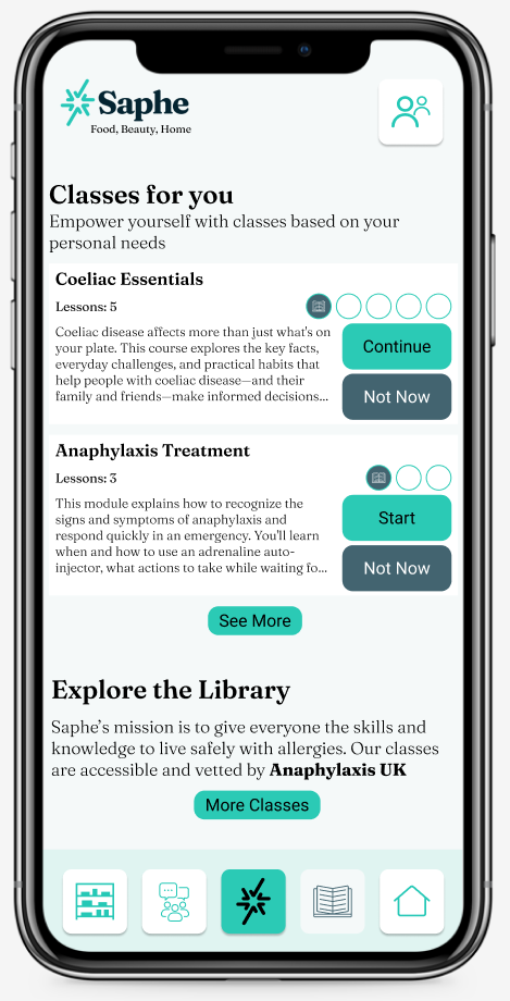
(Left) Classes are based on preferences - if a user says they have Coeliac disease then Saphe will populate with appropriate information. To avoid overwhelming, we place much of the full library behind a tap.
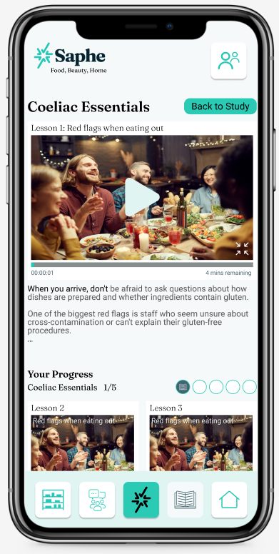
(Right) The Class screen has a typical YouTube style interface. The transcription auto progresses so users with hearing difficulties or no sound can still follow along and review the info at their own pace. Each class is split into bite-size pieces, and progress bars are used to encourage completion.
Deliver
Slide Deck & Conclusions
Below is the final slide deck presented to the Saphe Founder.
Overall it was a really interesting first project that highlighted just how complex hypersensitivity can be. My previous experience as a hospitality business owner taught me a lot of important information about managing allergens and training around the 14 “official” ingredients, but getting into the shoes of hypersensitive people showcased many design challenges that I did not expect at first.